What Makes a Great Construction Logo in 2026?
I work with a lot of construction companies and remodeling firms, and I see a lot of logo designs. The number one and two things to remember when designing or redesigning your logo is this:
- Keep it simple. Really! If you can delete an element from your logo (like extra decorative elements), delete it. Pare it down until it is simple and essential and works at any size on any screen. Look at the logos of the biggest companies on the planet. They are dead simple and are more memorable for that reason.
- Limit the color palette. You don’t need a rainbow; you need your brand color and maybe black. Your logo should not depend on color and should work in plain black in print, reversed in white against a dark background.
- Include your company name. I know I just said keep it simple, but you are a local remodeling company, and you don’t have enough brand recognition to get away with a pure graphic symbol, like the Nike swoosh. You need your company name to be present and legible, even at a small size. If you have a longer name, consider asking your logo designer to create a horizontal version (for places like your website header) and a square version (for places like a logo slider).
Create a Logo That Works Everywhere, Not Just in Ideal Conditions
Most homeowners first see a construction company logo on a 6-inch phone screen, not on a yard sign. A strong construction logo must quickly communicate “trustworthy, organized, safe” before customers read a single proposal.
Great construction logos for modern construction companies are: simple with few shapes and clean typography; memorable with one strong idea; versatile across web, social media posts, decals, contracts, and marketing materials; and scalable from favicon to billboard. A good construction logo must inspire trust and dependability, reflecting the company’s ability to deliver quality work while resonating with its target audience.
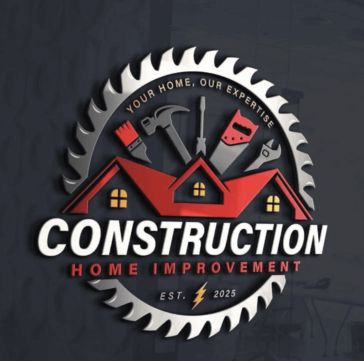
The best construction logos usually avoid clichéd hammers, roofs, and cranes unless those elements are abstracted into modern, geometric forms. Modern construction logos often utilize abstract designs that may not explicitly indicate construction but convey the brand’s values through color, shape, and font choices.
Why Simplicity Beats “Flashy” for Construction Company Logos
Compare a cluttered construction logo with a roofline, hammer, skyscraper, and slogan to a wordmark like Turner or Skanska. The simple mark wins because it survives real use.
Simple construction logos reproduce better on embroidered polos and jackets, hard hats and safety vests, vehicle wraps and jobsite signage, invoices, proposals, and digital ads.
Complex logos cost more to print, are harder to embroider, and become illegible in small social avatars. Experience shows owners are consistently happier with minimal construction company logos because they feel less dated five years later.
Raster Versus Vector: What Logo Files Do You Need?
If your logo designer sends you only raster files (like JPG or PNG), you have a problem. Raster files are essentially images. It’s what is used when you have unlimited colors and gradients. What you need instead are vector formats, like SVG for the web and PDF or EPS for print. These are saved as shapes rather than bitmap images. Vector files can be scaled to any size and will remain sharp. If your rainbow-colored logo with lots of fancy gradients and shadows can’t be saved as a vector, then it’s a good sign you need to go back to the drawing board.
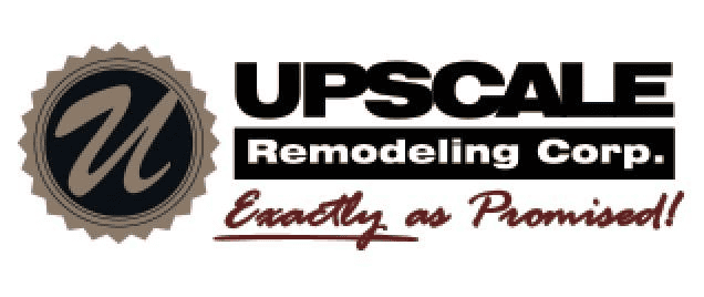
Case Study: Why the Upscale Remodeling Logo Works
Here’s a logo we redesigned for a client in Ithaca, NY. Their original logo design had lots of colors and backgrounds and was too intricate to reproduce well at small sizes. It also had their tagline tacked onto the bottom, which is something to avoid.
Old Logo:
New Logo:
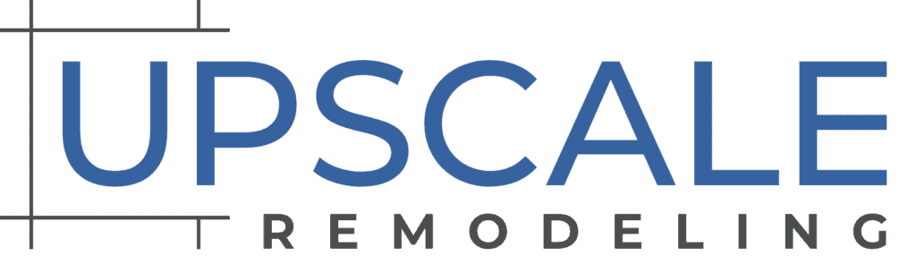
Simple Structure, Premium Feel
The Upscale Remodeling logo works because it is restrained: a clean wordmark, simple layout, and a premium feel. Its limited color palette uses dark gray plus a single accent, which helps the brand feel modern and professional.
Typography plays a critical role in logo design; clean, sans-serif fonts exude modernity and clarity, ideal for construction firms emphasizing precision. The logo reflects an organized, detail-oriented company suited for clients investing in quality work and complex projects.
How Upscale’s Logo Performs in the Real World
We evaluated the logo across websites, mobile headers, yard signs, social thumbnails, and embroidery. It remains legible at small sizes because it avoids thin lines and tiny decorative elements.
This is what every construction business should demand: an effective logo that performs, not just a creative mark that looks good on a dark background.
5 Rules for Designing a Great Construction Logo
These are the same rules Electromagnetic Web uses when guiding remodelers and general contractors through branding projects.
Rule 1: Keep It Simple
A good logo must work at 1 inch wide. Shrink it to 32×32 pixels; if it becomes a smudge, simplify. A construction logo should communicate strength, reliability, and precision through simple, bold designs and structural symbols.
Rule 2: Limit Your Color Palette to One Neutral and One Accent
Use black, charcoal, or dark blue as the base. Add one accent: yellow, orange, muted teal, or gold. Avoiding “full-color” or rainbow logos reduces printing costs, increases easy recognition, and makes the logo easier to match across web and print.
What NOT to do:
Colors evoke different emotions and can influence how a brand is perceived; for example, blue is often associated with trust and professionalism, while green can represent health and well-being. The choice of color in a logo can significantly impact brand recognition and client trust; for instance, a logo that uses bold colors like red can create a sense of urgency and energy, but must be balanced to maintain trustworthiness.
Rule 3: Choose Typography That Matches Your Construction Niche
Bold sans-serif fonts suit commercial construction and industrial contractors. Refined sans-serif or simple serif fonts work for high-end remodelers and custom home builders. Strong typography in construction logos often utilizes bold, sans-serif, or slab serif fonts to convey stability and strength.
Rule 4: Avoid Clip Art and Premade Icons
Premade roofs, hammers, and cartoon excavators make a construction company look cheap. If you want an icon, work from scratch with a designer on geometric beams, rectangles, or a monogram. It is essential for construction logos to function well in black and white and to avoid overused clip art to stand out from competitors.
Rule 5: Plan for a Logo System, Not Just a Single File
Ask for a horizontal version, stacked version, and monochrome version. Your professional logo package should include SVG, PNG, JPG, WEBP, PDF or EPS, plus black, white, and limited full-color primary versions. This saves time when ordering signage, shirts, or building new websites.
Step-by-Step: How to Design a Construction Logo That Converts
Step 1: Clarify Your Construction Niche and Audience
Residential renovations, custom homes, commercial construction, and heavy civil work each need a different mood. Write three words you want clients to feel: meticulous, calm, organized; or bold, fast, rugged.
Step 2: Collect Targeted Inspiration Without Copying
Review Caterpillar Inc., Turner, Bechtel, PCL, regional remodelers, architecture firms, and other logos. Focus on structure, font choices, color usage, and layout. Save 10–15 examples before you start designing.
Step 3: Sketch 3–5 Simple Concepts
Try a pure wordmark, a monogram, or an abstract icon paired with type. Do not use detailed buildings, gradients, or photo-style imagery.
Step 4: Test at Small and Large Sizes
Mock up the logo on a truck, hard hat, phone header, and business cards. Ask 3–5 trusted clients what the mark makes them feel in one sentence.
Step 5: Finalize Files with a Professional Designer
Even if you begin with a design contest or an affordable price freelancer, have a professional refine the final custom logo. Your brief should include exact company name, color range, example references, and use cases.
Best Colors and Fonts for Construction Company Logos
Color and typography are noticed before symbolism. Colors like yellow and orange in construction logos suggest safety and visibility, while blue and gray evoke professionalism and trust, aligning with the brand’s identity. Colors like yellow and orange in construction logos suggest safety and visibility, while black and navy convey professionalism and strength.
Colors like red, orange, and black convey strength and energy, while earthy tones like green or gray suggest stability and environmental awareness in construction logos. The best construction logos often incorporate geometric shapes, bold typography, and earthy tones to evoke a sense of stability and trust.
Common logo styles in construction include minimalist and modern designs with clean lines, emblem badges, and structural lettering that reinforce durability. Effective construction logos are scalable for use on various media and often incorporate geometric shapes to suggest structural integrity.
Logo Formats and Variations Every Construction Company Needs
Your ideal logo should include SVG for crisp web scaling, PNG with transparent background, JPG or WEBP for general use, and PDF or EPS for printers. Provide RGB for screens and CMYK for print.
Each construction company logo needs a limited primary version, one-color black or dark gray version, and one-color white version for dark backgrounds. Also request wide and stacked layouts so your own construction logo works everywhere.
Common Mistakes in Construction Logo Design and How to Avoid Them
Mistake 1: Overloaded Symbols and Tiny Details
Detailed houses, skylines, and tools disappear at small sizes. Fix it by using one strong symbol, or none.
Mistake 2: Too Many Colors and Gradients
Gradients and 4–5 colors break on embroidery and vinyl. Pick one brand accent with black, gray, or white.
Mistake 3: Illegible Fonts
If someone cannot read the company name on a passing truck, the logo is failing. Choose open, bold letterforms.
Mistake 4: Inconsistent Use Across Materials
Different versions of signs, proposals, and apparel make a business feel disorganized. Create a one-page style guide.
Conclusion: Build a Strong Brand with a Great Construction Logo
A perfect logo balances simplicity, professionalism, and originality to communicate strength, reliability, and expertise. By focusing on clean typography, a limited color palette, and versatile formats, your construction logo will stand out across every medium, from hard hats to websites.
At Electromagnetic Web, we specialize in helping home remodelers and construction firms design logos that truly represent their craftsmanship and professionalism. If you’re ready to elevate your brand and attract higher-quality clients, contact us today to re-design a logo, and indeed, branding, that works as hard as you do and sets your business apart in a competitive market.
About the Author

Eric Thomas is the founder of Electromagnetic Web, where he helps remodeling and home-services companies turn their websites into reliable lead generators. He writes about SEO, paid advertising, and the practical side of growing a contracting business online. He’s based in Madison, Wisconsin, and works with contractors across the country. When he’s not optimizing campaigns, you’ll find him sailing the Caribbean with his family. Connect with him at electromagneticweb.com.